Using Dashboards in Visualize by Healthie
Dashboards are part of the Visualize tab in Healthie, your central hub for reporting and insights. Visualize includes both downloadable reports and, in some cases, interactive dashboards that let you explore data right in the platform.
Currently, the dashboards below are the fully visual dashboards available. Other sections within Visualize — like Cancellations and Authorization — allow you to filter data and download reports as CSVs, but do not yet include on-screen visualizations.
Dashboards are available on all Paid Plans.
IN THIS ARTICLE:
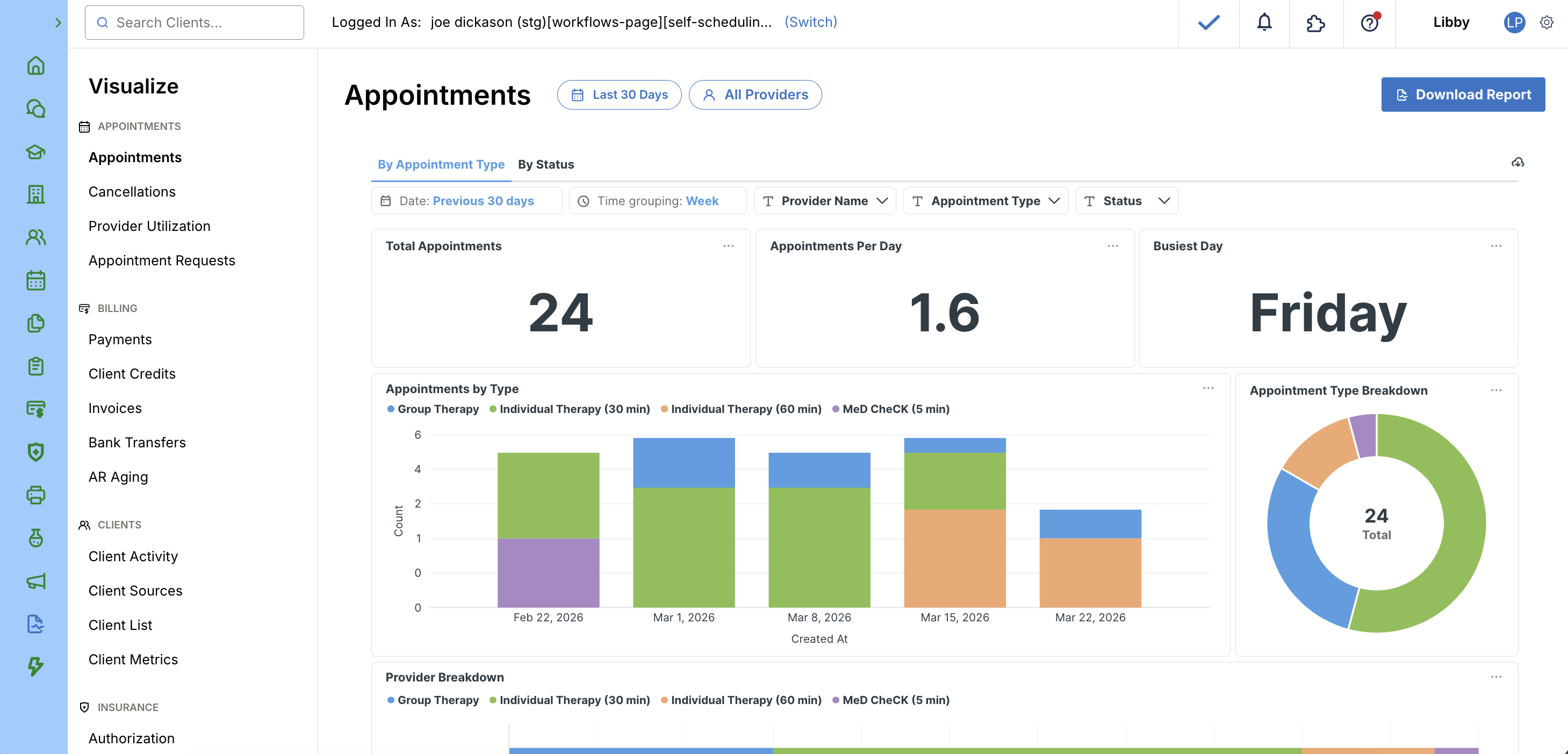
Appointments Dashboard and Report
The Appointments Dashboard gives you a visual overview of appointment activity across your organization. It pulls from the same data as the downloadable Appointments Report and helps you identify trends at a glance.
Get a deep dive of the Appointments Dashboard and Report here.
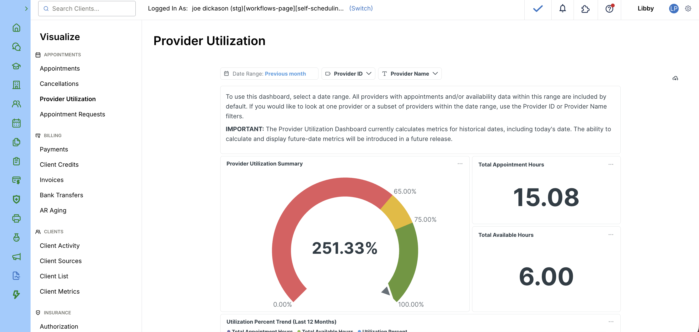
Provider Utilization Dashboard
The Provider Utilization Dashboard enables you to track and analyze how efficiently your providers are using available time. You can download the report as a CSV file for further analyses.
Click here to learn more about the Provider Utilization Dashboard and Report.
Appointment Requests Dashboard
With the Appointment Request Metrics Dashboard, practices have a dedicated space to see exactly how their scheduling pipeline is performing - from first request to first appointment.
Click here to learn more about the Appointment Requests Dashboard.

Payments Dashboard and Report
The Payments Dashboard gives you instant access to comprehensive payment data. This tool empowers finance teams to explore, filter and analyze payment information.
Click here to learn more about the Payments Dashboard and Report.

AI Scribe Usage Dashboard
The AI Scribe Usage Dashboard gives Admins and Org Owners a clear view of their organization's Scribe minutes consumption, directly in Healthie. The dashboard displays minutes used month to date and is refreshed daily.
The Scribe Usage Dashboard is available to organizations with an active AI Charting subscription. Access is limited to Admins and Org Owners.
Click here to learn more about the AI Scribe Usage Dashboard.
